
Design Canvas
The Design Canvas — StatStream’s Advanced Diagram Design Canvas — is where you build the visual layout of a diagram — shapes, electrical/mechanical symbols, images, and a widget clock, arranged on a resizable canvas. It’s designed to fully replace uploading static diagram images: create and edit SLDs and technical diagrams directly in StatStream, without external design tools.
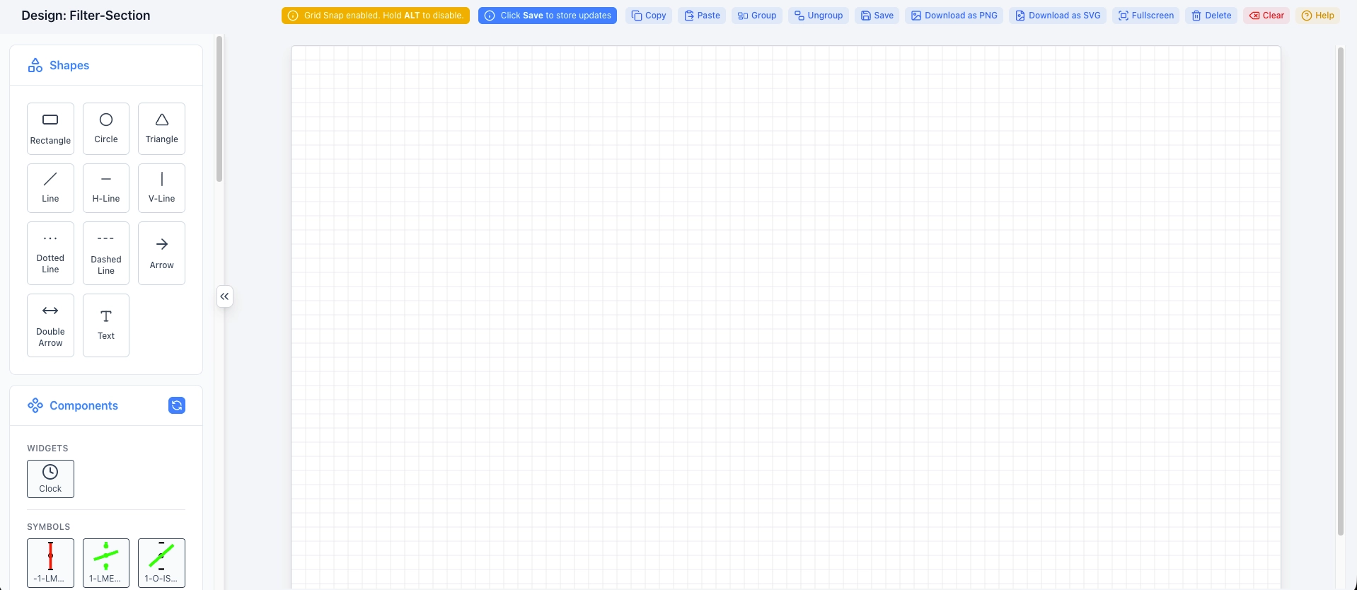
Toolbar
Section titled “Toolbar”| Action | Description |
|---|---|
| Copy / Paste | Duplicate selected elements. |
| Group / Ungroup | Combine multiple elements so they move and resize together, or split them back apart. |
| Save | Store your updates to the diagram. |
| Download as PNG / Download as SVG | Export the diagram as an image file. |
| Fullscreen | Expand the canvas to fill the screen while editing. |
| Delete | Remove the selected element. |
| Clear | Remove everything from the canvas. |
Shapes
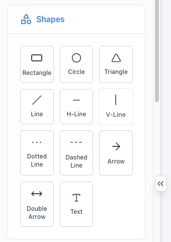
Section titled “Shapes”Basic drawing primitives for building your schematic:
Rectangle, Circle, Triangle, Line, H-Line, V-Line, Dotted Line, Dashed Line, Arrow, Double Arrow, Text.
Components
Section titled “Components”Widgets
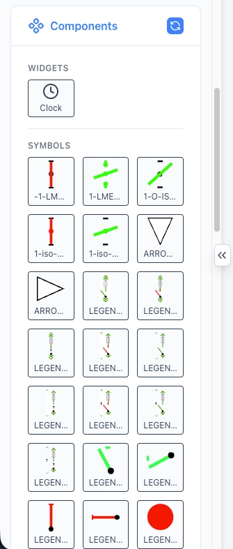
Section titled “Widgets”- Clock — displays the current date and time directly on the diagram.
Symbols
Section titled “Symbols”A library of pre-built electrical and process symbols (isolators, arrows, legend markers, and status indicators) that can be dragged directly onto the canvas — useful for building single-line diagrams (SLDs) and process schematics without drawing each shape from scratch.
Images
Section titled “Images”| Option | Description |
|---|---|
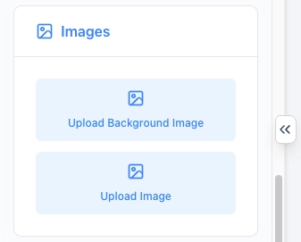
| Upload Background Image | Set an image (e.g. a floor plan or facility layout) as the canvas background. |
| Upload Image | Add a standalone image element onto the canvas. |
Canvas Size
Section titled “Canvas Size”Set the working dimensions of the canvas in pixels:
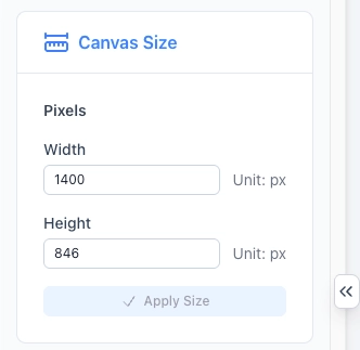
| Field | Description |
|---|---|
| Width | Canvas width, in pixels. |
| Height | Canvas height, in pixels. |
Click Apply Size after changing these values.
Properties
Section titled “Properties”Selecting an element on the canvas reveals its properties:
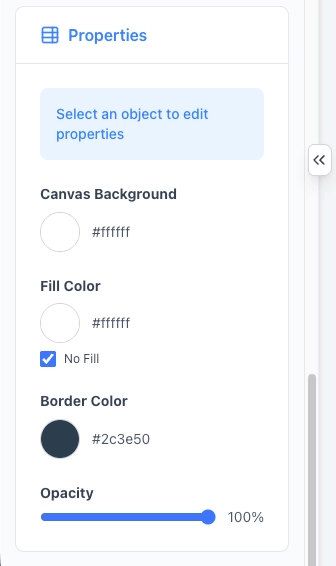
| Property | Description |
|---|---|
| Canvas Background | Background color of the canvas itself, in hex. |
| Fill Color | Fill color of the selected shape. Check No Fill to leave it transparent. |
| Border Color | Border/stroke color of the selected shape. |
| Opacity | Transparency of the selected element, from 0–100%. |
Once your layout is ready, move on to Placements to pin live data onto it.