
Aggregation Widgets
These widgets summarize data over a selected time period — daily, monthly, or a custom duration — rather than plotting every raw data point. They’re useful for spotting trends across days or months without the noise of continuous live data.
Daily Aggregation-Bar Widget
Section titled “Daily Aggregation-Bar Widget”The daily aggregation widget shows a bar chart of aggregated data points over the selected days.
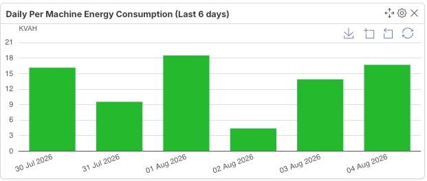
Configuration
Section titled “Configuration”| Field | Description |
|---|---|
| Variable ID | Select the numeric (float) or increment variable to visualize. Only numeric (float) or increment variables can be visualized in an aggregation bar graph. |
| Aggregation | Select the data aggregation method. |
| Start Time (24-hour Format) | Choose the hour (00–23) from which data aggregation should begin. |
| Duration (Hours) | Specify how many hours of data should be considered. |
| No. of Past Days | Select the number of past days to include for aggregation. |
| Marker Label | Enter the label for the marker line. This label will be displayed on the marker line in the chart. |
| Marker Value | The marker line will appear at this Y-axis value. |
- Supports only numeric (float) and increment variables.
- The marker line is optional and useful for highlighting a target or threshold value on the chart.
Monthly Aggregation-Bar Widget
Section titled “Monthly Aggregation-Bar Widget”The monthly aggregation widget shows a bar chart of aggregated data points over the selected months.
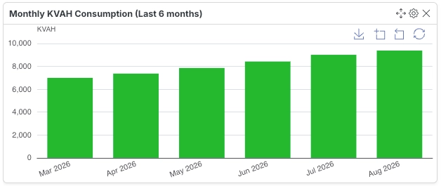
Configuration
Section titled “Configuration”| Field | Description |
|---|---|
| Variable ID | Select the numeric (float) or increment variable to visualize. Only numeric (float) or increment variables can be visualized in an aggregation bar graph. |
| Aggregation | Select the data aggregation method. |
| No. of Months | Select the number of months to include for aggregation. |
| Marker Label | Enter the label for the marker line. This label will be displayed on the marker line in the chart. |
| Marker Value | The marker line will appear at this Y-axis value. |
- Supports only numeric (float) and increment variables.
- Useful for month-over-month trend comparisons, such as tracking monthly consumption or output.
Dual Axis Aggregation Widget
Section titled “Dual Axis Aggregation Widget”Displays a combined bar and line chart in a single graph, allowing comparison of two aggregated variables over the same time range.
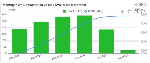
Configuration
Section titled “Configuration”| Field | Description |
|---|---|
| Bar Variable ID | Select the numeric or increment variable to be displayed as bars in the chart. |
| Bar Aggregation | Choose how the bar variable data should be aggregated for each time interval. |
| Line Variable ID | Select the numeric or increment variable to be displayed as a line in the same chart. |
| Line Aggregation | Choose how the line variable data should be aggregated for each time interval. |
| Take Data Since | Specify how many past time units to include in the aggregation. Hours: 1–24, Days: 1–30, Months: 1–12. |
| Duration Unit | Select the time unit used for aggregation and data lookback. |
- Supports two numeric or increment variables — one as bars, one as a line.
- Each variable can use its own aggregation method and is plotted against a shared time axis.
- Ideal for comparing two related but differently-scaled metrics, such as total output (bars) against an efficiency ratio (line).