
Chart Widgets
These widgets help visualize time-series data, compare multiple variables, identify trends, monitor performance, and analyze relationships between process variables. Each widget is designed for a specific visualization use case, ranging from simple line charts and bar graphs to heat maps and dual-axis comparisons.
Line Widget
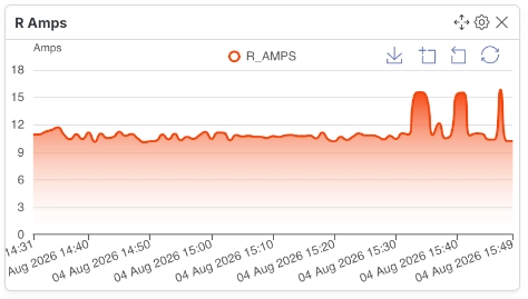
Section titled “Line Widget”A Line Widget displays data points connected by lines, making it ideal for monitoring trends over time or continuous process variables.
Configuration
Section titled “Configuration”| Field | Description |
|---|---|
| Variable ID | Select the numeric (float) or increment variable to visualize. |
| Line Type | Choose how data points are connected (Smooth or Straight). |
| Area Fill | Select None, Solid, or Gradient fill below the line. |
| Vertical Size | Determines the height of the widget. |
- Supports only numeric (float) and increment variables.
- Smooth lines create curved transitions between data points.
- Area fill improves trend visualization.
Multi-Line Widget
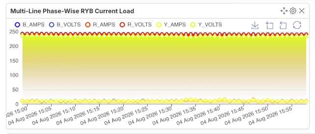
Section titled “Multi-Line Widget”A Multi-Line Widget compares multiple variables by plotting them on the same chart.
Configuration
Section titled “Configuration”| Field | Description |
|---|---|
| Variable IDs | Select up to 10 numeric or increment variables. |
| Line Type | Choose Smooth or Straight lines. |
| Area Fill | Select None, Solid, or Gradient fill. |
- Supports up to 10 variables.
- Useful for comparing multiple measurements over the same period.
- Supports only numeric (float) and increment variables.
Dual Y Axis Line Widget
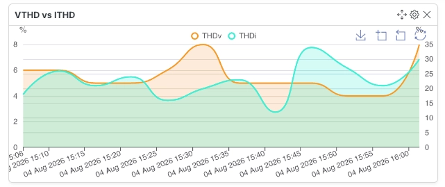
Section titled “Dual Y Axis Line Widget”A Dual Y Axis Line Widget displays two variables on the same chart using independent Y-axes.
Configuration
Section titled “Configuration”| Field | Description |
|---|---|
| Variable ID (Left Axis) | Select the first numeric variable. |
| Variable ID (Right Axis) | Select the second numeric variable. |
- Supports two numeric variables.
- Each variable is displayed using its own Y-axis.
- Ideal for comparing variables with different units or value ranges.
Bar Widget
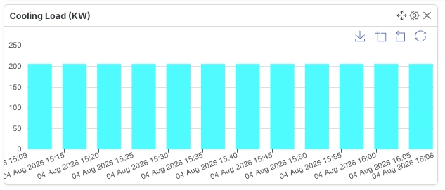
Section titled “Bar Widget”A Bar Widget compares values across categories using vertical or horizontal bars.
Configuration
Section titled “Configuration”| Field | Description |
|---|---|
| Variable ID | Select the numeric or increment variable to display. |
| Bar Direction | Select whether bars are displayed vertically or horizontally. |
- Supports numeric (float) and increment variables.
- Useful for comparing values across categories.
Bar Race Widget
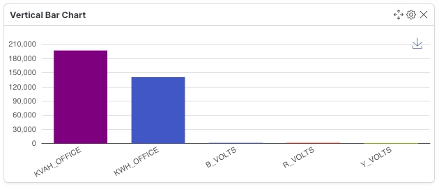
Section titled “Bar Race Widget”A Bar Race Widget animates and reorders bars as values change over time, making it ideal for visualizing live rankings.
Configuration
Section titled “Configuration”| Field | Description |
|---|---|
| Variable IDs | Select up to 6 numeric variables. |
| Chart Type | Select Vertical or Horizontal animation. |
| Vertical Size | Determines the height of the widget. |
- Supports up to 6 variables.
- Automatically updates rankings as values change.
- Ideal for live comparisons between multiple variables.
Pie Widget
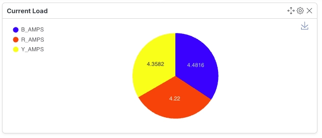
Section titled “Pie Widget”A Pie Widget represents proportional values as slices of a circle.
Configuration
Section titled “Configuration”| Field | Description |
|---|---|
| Variable IDs | Select up to 10 numeric or increment variables. |
| Chart Type | Select Pie, Doughnut, or Half Doughnut. |
| Display | Choose how values are displayed within the chart. |
| Vertical Size | Determines the height of the widget. |
- Supports Pie, Doughnut, and Half Doughnut charts.
- Best suited for part-to-whole comparisons.
- Supports up to 10 variables.
Multi Bar-Line Widget
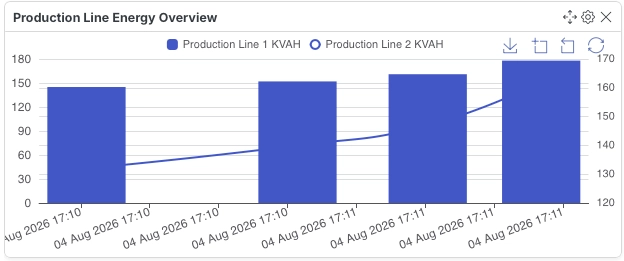
Section titled “Multi Bar-Line Widget”A Multi Bar-Line Widget combines bar and line visualizations on the same chart using separate Y-axes.
Configuration
Section titled “Configuration”| Field | Description |
|---|---|
| Bar Variables | Select up to 5 periodic variables to display as bars. |
| Line Variables | Select up to 5 periodic variables to display as lines. |
- Supports periodic variables only.
- Uses separate Y-axes for bars and lines.
- Useful for comparing different types of periodic measurements.
Multi-Line Stats Widget
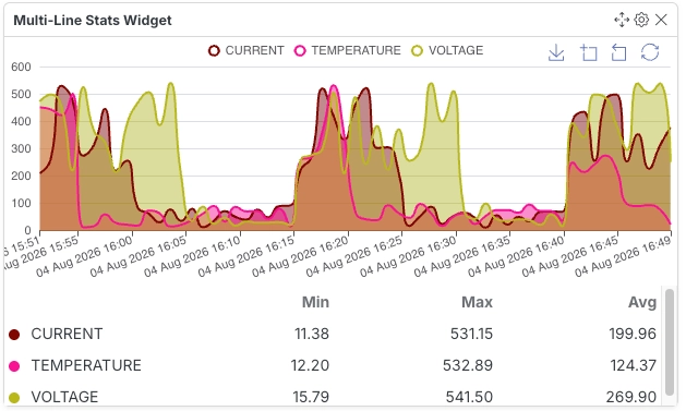
Section titled “Multi-Line Stats Widget”A Multi-Line Stats Widget displays multiple trend lines together with summary statistics for each variable.
Configuration
Section titled “Configuration”| Field | Description |
|---|---|
| Variable IDs | Select up to 6 numeric or increment variables. |
| Line Type | Choose Smooth or Straight lines. |
| Area Fill | Select None, Solid, or Gradient fill. |
| Vertical Size | Determines the height of the widget. |
- Displays the minimum, maximum, and average values for each selected variable.
- Supports up to 6 variables.
- Useful for historical performance analysis.
Heat Map Widget
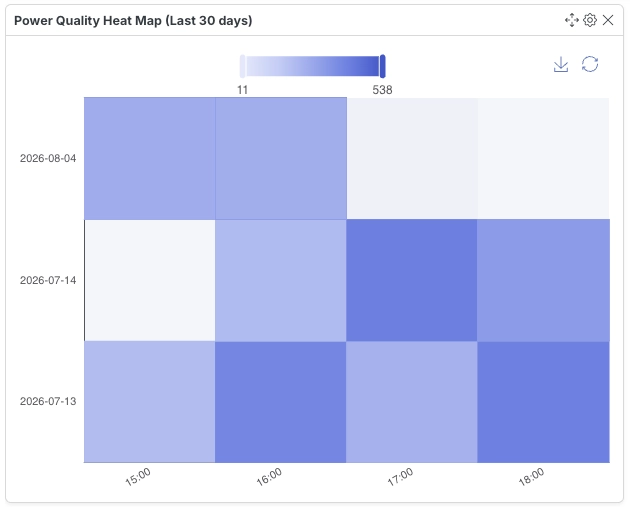
Section titled “Heat Map Widget”A Heat Map Widget visualizes the intensity of values over time using color gradients.
Configuration
Section titled “Configuration”| Field | Description |
|---|---|
| Variable ID | Select the numeric variable to visualize. |
| Time Period | Select the period for heat map analysis. |
| Display Cell Values | Enable or disable value labels within each cell. |
- Uses color intensity to represent value magnitude.
- Supports configurable time periods.
- Cell values can optionally be displayed.
Power Factor Line Widget
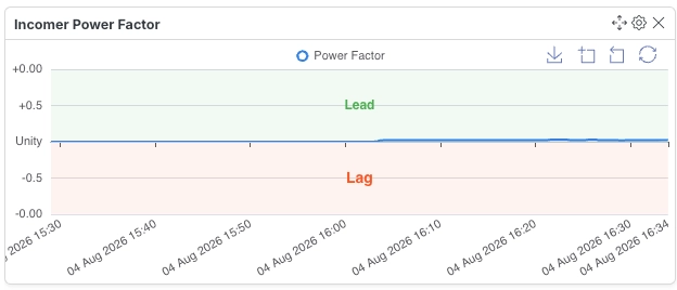
Section titled “Power Factor Line Widget”A Power Factor Line Widget is designed specifically for monitoring and analyzing power factor trends over time.
Configuration
Section titled “Configuration”| Field | Description |
|---|---|
| Variable ID | Select a variable tagged with sys_power_factor. |
- Only variables tagged with
sys_power_factorare supported. - Designed specifically for electrical power factor monitoring.
- Helps identify lagging or leading power factor conditions.