
Action & Control Widgets
These widgets let users interact directly with connected equipment from a dashboard — flipping a device on or off, triggering a single action, or setting a value within a range.
ON/OFF Widget
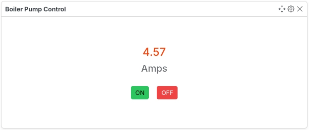
Section titled “ON/OFF Widget”An ON/OFF widget is used to control or perform the configured actions.
Configuration
Section titled “Configuration”| Field | Description |
|---|---|
| Variable ID | Select the variable that controls the ON/OFF state. |
| Action 1 | Specify the first action to execute when the ON button is pressed. |
| Action 1 Button Label (Green) | Enter the label for the button that triggers the first action. |
| Action 2 | Specify the second action to execute when the OFF button is pressed. |
| Action 2 Button Label (Red) | Enter the label for the button that triggers the second action. |
- Displays two buttons — green for Action 1, red for Action 2 — each triggering a separately configured action.
- Button labels are fully customizable and don’t have to read “ON” / “OFF”.
Single Action Widget
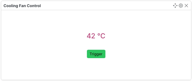
Section titled “Single Action Widget”An Single Action widget is used to control or perform the configured action.
Configuration
Section titled “Configuration”| Field | Description |
|---|---|
| Variable ID | Select the variable that this widget will monitor or control. |
| Action | Specify the action to execute when the button is pressed. |
| Action Button Label | Enter the label for the button that triggers the action. |
- Displays a single button that triggers one configured action — simpler than the ON/OFF Widget, which supports two.
Text Action Widget
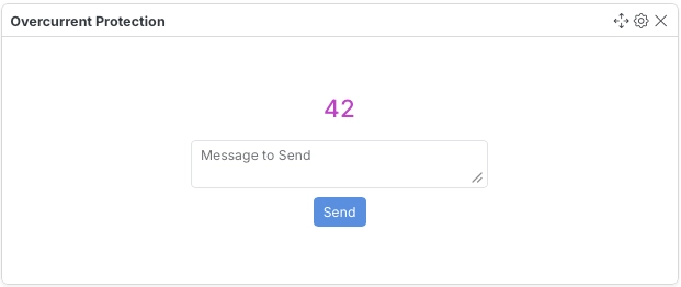
Section titled “Text Action Widget”The Text Action Widget displays the value of a selected variable and executes a specified action.
Configuration
Section titled “Configuration”| Field | Description |
|---|---|
| Variable ID | Select the variable whose value will be displayed by the widget. |
| Action | Specify the action to execute when the widget is interacted with. |
- Combines a live value display with an interactive trigger in a single widget.
Range Slider Widget
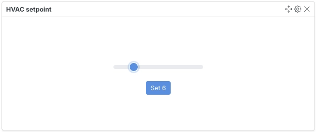
Section titled “Range Slider Widget”A range slider is used to set a value within a range.
Configuration
Section titled “Configuration”| Field | Description |
|---|---|
| Variable ID | Select the variable that range slider will control. |
| Action | Specify the action to execute when the slider value is changed. |
| Minimum Range Value | Specify the minimum value of the range. |
| Maximum Range Value | Specify the maximum value of the range. |
| Step | Specify the step value of the range. |
- The step value determines the increment between selectable values as the slider is dragged.